Scheduled Downtime
On Tuesday 24 October 2023 @ 5pm MT the forums will be in read only mode in preparation for the downtime. On Wednesday 25 October 2023 @ 5am MT, this website will be down for maintenance and expected to return online later in the morning.
Normal Operations
The forums are back online with normal operations. If you notice any issues or errors related to the forums, please reach out to help@ucar.edu

Help with Python polar stereographic plotting of CICE and POP data

I've recently made the switch to Python after 15 years of coding in Matlab. My classes have all always been in Matlab and it is what my advisors use so I've been learning on my own through the really great NCAR Xdev tutorials and other tutorials I've found online. I have been using Xarray and Cartopy to make polar stereographic plots of CAM data and it works great, but I'm running into trouble trying to do anything with POP or CICE output. I believe it is because of the displaced pole grid, but I'm not entirely sure. When I plot CICE data on a Robinson projection it is fine but when I plot in polar stereo it is just blank. For instance here where dsice is a single monthly history output:

da = dsice['hi'].squeeze()

subplot_kws=dict(projection=ccrs.PlateCarree(),
facecolor='lightgrey')
fig=plt.figure(figsize=(16, 8))
ax1 = fig.add_subplot(1, 1, 1, projection=ccrs.SouthPolarStereo())
ax1.set_extent([-180, 180, -90, -60], crs=ccrs.PlateCarree())
p = da.plot(x='nj', y='ni',
#cmap=cm.RdBu_r, vmin=-2, vmax=2,
subplot_kws=subplot_kws,
transform=ccrs.PlateCarree())
ax1.coastlines('50m')

I tried segmenting the data (ex. p = da[:360, :].plot) after finding someone asking a similar question about plotting CICE data on another forum but that didn't work and also wouldn't help me for plotting Arctic data. When I try to plot POP data the kernel always crashes. What I'm trying is first extracting a 30 year section of the TEMP variable, taking the mean, then picking one depth slice so all I have left is a 320x384 array. I figured that would plot easy enough, but it inevitably crashes the kernel and this is the only time I've run into that issue, but it happens every time I try to plot POP data. I should also note I am using CESM1/POP2 not CESM2/MOM6 and I am using downloaded time series files on my own computer, not on Cheyenne.

I would ask this question on a place like stack exchange but I figured I'd try here since I think the answers are CESM specific more than python general questions. If anyone has advice, example plotting code, or online tutotirals specific to CICE and POP please let me know. Thanks!
 

dbailey

CSEG and Liaisons
Staff member
Right, you probably need special routines that use the displaced pole lat and lon fields. I have done this using the PyNGL codes (NCL in python). I haven't had much experience with cartopy though. I think outside people can join the ESDS forum on zulip.ucar.edu. There is likely some discussion here about polar stereographic plots.
 

mlevy

Michael Levy
CSEG and Liaisons
Staff member
Could you provide more detail on what you are doing with the pop workflow? Assuming you have 30 years of output in ds and you want to plot the surface values then

Code:
ds.isel(z_t=0).mean('time').plot()

should make a rough plot on the model grid (with the north pole displaced into greenland, so you'll have land at top of plot). I have some thoughts on what could be going wrong if even that command doesn't work, but I don't want to speculate too much without seeing the exact error message. It would also be helpful to see the command you are using to read in the data (is it xr.open_mfdataset? is it reading in the data or using dask's lazy operations?)

If you're interested in joining zulip, let me know and I can send you an invite (assuming your username is your email address with _ replacing .)

~Mike
Thanks! Here is what I tried:

OcnTempData = xr.open_mfdataset('/home/shaina/Documents/CoupledRCP85/FinalCoup.pop.h.TEMP.*', combine='by_coords')
OcnTemp = OcnTempData.TEMP
OcnTemp_2050to2070_Coup = OcnTemp.sel(time=slice('2050-01-01', '2070-01-01')).mean('time')
T400m_2050to2070_Coup = OcnTemp_2050to2070_Coup[30,:,:] (I should switch this line to using isel(z_t) as in your example)
T400m_2050to2070_Coup

This yields a 480 kb array of 320x384

This was how I originally tried plotting since using the same workflow on cam data works, but for this it just shows the hourglass for a while and then gives a kernel is dead message. It has never given any other error message.

subplot_kws=dict(projection=ccrs.PlateCarree(),
facecolor='lightgrey')
fig=plt.figure(figsize=(16, 8))
ax1 = fig.add_subplot(1, 1, 1, projection=ccrs.SouthPolarStereo()) #,facecolor='grey'
ax1.set_extent([-180, 180, -90, -60], crs=ccrs.PlateCarree())
p = T400m_2050to2070_Coup.plot(x='lon', y='lat',
vmin=-3, vmax=3,
cmap=cmocean.cm.balance,
subplot_kws=subplot_kws,
transform=ccrs.PlateCarree())
ax1.coastlines('50m')

So then I wondered if trying a more basic plot would work and tried this but the same thing happens (see screenshot).
T400m_2050to2070_Coup.plot()

I would be happy to join zulip.
 

Attachments

  • Screenshot from 2022-05-05 11-33-17.png
    Screenshot from 2022-05-05 11-33-17.png
    124.4 KB · Views: 10

duvivier

CSEG and Liaisons
Staff member
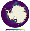
Below is some code that I made to use the attached polar stereographic SH figure. Note that this is easier than the Northern Hemisphere because the weird poles require regridding for correct plotting.

All the environment stuff:
import xarray as xr
import numpy as np
import matplotlib.pyplot as plt
import pop_tools
from datetime import timedelta
import glob
import dask
from matplotlib.gridspec import GridSpec
import matplotlib.path as mpath
import cartopy.crs as ccrs
import cartopy.feature as cfeature
import pandas as pd
import nc_time_axis

Get your actual field to plot here.
# Your field to plot here:
variable_to_plot (dimensions should include nlat x nlon)

Note that if you use the TLAT/TLONG from a CICE file it has missing values and that can mess up the plotting. that's why I use the grid tool below. But you could also read these in directly from a POP file instead.
# get pop grid grid cell areas
grid = pop_tools.get_grid('POP_gx1v7')
grid
# get lat and lon
TLAT = grid['TLAT']
TLONG = grid['TLONG']

This function fixes the cyclic coordinates for proper plotting. There is something similar with GeoCat but it didn't always work properly for me.
def adjust_pop_grid(tlon,tlat,field):
nj = tlon.shape[0]
ni = tlon.shape[1]
xL = int(ni/2 - 1)
xR = int(xL + ni)

tlon = np.where(np.greater_equal(tlon,min(tlon[:,0])),tlon-360.,tlon)
lon = np.concatenate((tlon,tlon+360.),1)
lon = lon[:,xL:xR]

if ni == 320:
lon[367:-3,0] = lon[367:-3,0]+360.
lon = lon - 360.
lon = np.hstack((lon,lon[:,0:1]+360.))
if ni == 320:
lon[367:,-1] = lon[367:,-1] - 360.

#-- trick cartopy into doing the right thing:
# it gets confused when the cyclic coords are identical
lon[:,0] = lon[:,0]-1e-8

#-- periodicity
lat = np.concatenate((tlat,tlat),1)
lat = lat[:,xL:xR]
lat = np.hstack((lat,lat[:,0:1]))

field = np.ma.concatenate((field,field),1)
field = field[:,xL:xR]
field = np.ma.hstack((field,field[:,0:1]))
return lon,lat,field

Not needed unless you want a circular boundary
# make circular boundary for polar stereographic circular plots
theta = np.linspace(0, 2*np.pi, 100)
center, radius = [0.5, 0.5], 0.5
verts = np.vstack([np.sin(theta), np.cos(theta)]).T
circle = mpath.Path(verts * radius + center)

Actually plot. You will have to use your variable name in the bold area.
# Plot with pcolormesh
vmax_in = 0
vmin_in = 0.1
cmap_in = plt.cm.get_cmap('viridis')

# create figure
fig = plt.figure(figsize=(20,10))

# fix the variable for plotting
lons = TLONG
lats = TLAT
lon, lat, field_1 = adjust_pop_grid(lons, lats, variable_to_plot)

# plot the region as subplots - note it's nrow x ncol x index (starting upper left)
ax = fig.add_subplot(1,1,1, projection = ccrs.SouthPolarStereo())
ax.add_feature(cfeature.LAND,zorder=100,edgecolor='k')
ax.set_boundary(circle, transform=ax.transAxes)
ax.set_extent([0.005, 360, -90, -60], crs=ccrs.PlateCarree())
this = ax.pcolormesh(lon, lat,
field_1,
transform=ccrs.PlateCarree(),
cmap = cmap_in,
vmax =vmax_in, vmin=vmin_in)
plt.colorbar(this,orientation='horizontal',label='fraction',fraction=0.03,pad=0.05)

Using this code I was able to make a figure like what is attached. Hopefully this helps!
 

Attachments

  • Screen Shot 2022-05-05 at 10.57.07 AM.png
    Screen Shot 2022-05-05 at 10.57.07 AM.png
    143.5 KB · Views: 9
Last edited:
Below is some code that I made to use the attached polar stereographic SH figure. Note that this is easier than the Northern Hemisphere because the weird poles require regridding for correct plotting.

All the environment stuff:


Get your actual field to plot here.


Note that if you use the TLAT/TLONG from a CICE file it has missing values and that can mess up the plotting. that's why I use the grid tool below. But you could also read these in directly from a POP file instead.


This function fixes the cyclic coordinates for proper plotting. There is something similar with GeoCat but it didn't always work properly for me.


Not needed unless you want a circular boundary


Actually plot. You will have to use your variable name in the bold area.


Using this code I was able to make a figure like what is attached. Hopefully this helps!

Thank you for this explanation! I am trying to get it to work but when I get to the plotting section I am getting the exact same issue as before- that the kernel has died and needs to restart. I'm unclear why this is happening.
 
Top